Resources
Brand Guideline
Style Guide

Logo

The logo versions of Softwareseni & Software Services Indonesia. Please keep in mind that that each logo serves serves its own purposes. Click the link below for the complete rule of how to use it.
How to use it?
Softwareseni
Software Services Indonesia
Logo Full Color
Logo Full Color
PNGSVG
Logo Full Color
Logo Full Color
PNGSVG
Logo For Dark Background
PNGSVG
Logo For Dark Background
PNGSVG
Logo Black Version
Logo Black Version
PNGSVG
Logo Black Version
Logo Black Version
PNGSVG
Logo White Version
Logo White Version
PNGSVG
Logo White Version
Logo White Version
PNGSVG
Logo Mark Full Color
PNGSVG
Logo Mark Full Color
PNGSVG
Logo Mark Black
Logo Mark Black
PNGSVG
Logo Mark Black
Logo Mark Black
PNGSVG
Logo Mark White
Logo Mark White
PNGSVG
Logo Mark White
Logo Mark White
PNGSVG

Typefaces

Standard typeface that represents Softwareseni. Use the Ubuntu only for the titles and Roboto for other needs such as bodytext, label, etc.
How to use it?
Ubuntu
DOWNLOAD
Roboto
DOWNLOAD

Templates

Softwareseni’s basic templates for Spreadsheets, Docs, and Canvas. These materials were intended to be used for projects, tasks, internal support, or any kind of other company’s purposes only.
Spreadsheets
Slides
Sheet - Full Version
DUPLICATE
Sheet - Standard Table
DUPLICATE
Sheet - Note/Summary
DUPLICATE
Sheet - Checklist
DUPLICATE
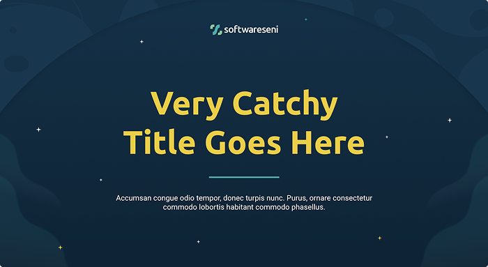
SCRUM Slides
DUPLICATE
External slides
DUPLICATE
Internal slides
DUPLICATE
All Hands Template
DUPLICATE
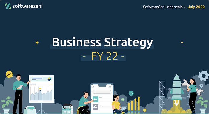
SSID - Business Strategy
DUPLICATE
Master May 2025
DUPLICATE
Sales Deck
DUPLICATE
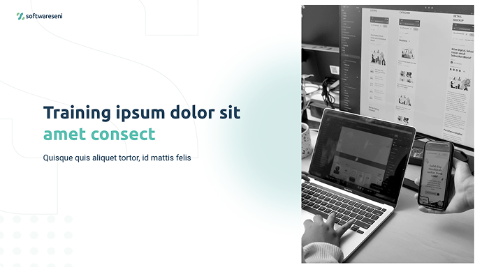
Training Slide
DUPLICATE

Virtual Background

A gallery of our customizable backgrounds for video meetings background. Helping you to enhance your appearance, maintain privacy, or set a professional tone on the meeting.
Graphic
Landmark
Office
Landmark - 02
DOWNLOAD
Landmark - 01
DOWNLOAD
Graphic - 02
DOWNLOAD
Graphic - 01
DOWNLOAD
Office - 06
DOWNLOAD
Office - 05
DOWNLOAD
Office - 04
DOWNLOAD
Office - 03
DOWNLOAD
Office - 02
DOWNLOAD
Office - 01
DOWNLOAD

Illustrations

The complete gallery of all illustrations that Softwareseni produced since 2021. Feel free to download and use them in your slides, docs, or tasks.
How to use it?
AI
Analysis
Customer Support
Growing/Growth
Meeting
Mobile App
Programming
Technology
Time Management
Working Together
e-Commerce
LOGO FULL COLOR
PNGSVGEPS
LOGO FOR DARK BACKGROUND
PNGSVGEPS
LOGO BLACK VERSION
PNGSVGEPS
LOGO WHITE VERSION
PNGSVGEPS
AI - 5
AI - 5
PNGSVG
AI - 4
AI - 4
PNGSVG
AI - 3
AI - 3
PNGSVG
AI - 2
AI - 2
PNGSVG
AI - 1
AI - 1
PNGSVG
Growing-Growth - 23
Growing-Growth - 23
PNGSVG
Mobile App - 20
Mobile App - 20
PNGSVG
Meeting - 29
Meeting - 29
PNGSVG
Programming - 58
Programming - 58
PNGSVG
Programming - 57
Programming - 57
PNGSVG
Programming - 56
Programming - 56
PNGSVG
AI - 1
AI - 1
PNGSVG
AI - 2
AI - 2
PNGSVG
AI - 3
AI - 3
PNGSVG
AI - 4
AI - 4
PNGSVG
AI - 5
AI - 5
PNGSVG
Analysis - 01
Analysis - 01
PNGSVG
Analysis - 02
Analysis - 02
PNGSVG
Analysis - 03
Analysis - 03
PNGSVG
Analysis - 04
Analysis - 04
PNGSVG
Analysis - 05
Analysis - 05
PNGSVG
Analysis - 06
Analysis - 06
PNGSVG
Analysis - 07
Analysis - 07
PNGSVG
Analysis - 08
Analysis - 08
PNGSVG
Analysis - 09
Analysis - 09
PNGSVG
Analysis - 10
Analysis - 10
PNGSVG
Analysis - 11
Analysis - 11
PNGSVG
Analysis - 12
Analysis - 12
PNGSVG
Analysis - 13
Analysis - 13
PNGSVG
Analysis - 14
Analysis - 14
PNGSVG
Analysis - 15
Analysis - 15
PNGSVG
Analysis - 16
Analysis - 16
PNGSVG
Analysis - 17
Analysis - 17
PNGSVG
Analysis - 18
Analysis - 18
PNGSVG
Analysis - 19
Analysis - 19
PNGSVG
Analysis - 20
Analysis - 20
PNGSVG
Analysis - 21
Analysis - 21
PNGSVG
Analysis - 22
Analysis - 22
PNGSVG
Analysis - 23
Analysis - 23
PNGSVG
Analysis - 24
Analysis - 24
PNGSVG
Analysis - 25
Analysis - 25
PNGSVG
Analysis - 26
Analysis - 26
PNGSVG
Analysis - 27
Analysis - 27
PNGSVG
Analysis - 28
Analysis - 28
PNGSVG
Analysis - 29
Analysis - 29
PNGSVG
Analysis - 30
Analysis - 30
PNGSVG
Analysis - 31
Analysis - 31
PNGSVG
Analysis - 32
Analysis - 32
PNGSVG
Analysis - 33
Analysis - 33
PNGSVG
Analysis - 34
Analysis - 34
PNGSVG
Analysis - 35
Analysis - 35
PNGSVG
Analysis - 36
Analysis - 36
PNGSVG
Analysis - 37
Analysis - 37
PNGSVG
Analysis - 38
Analysis - 38
PNGSVG
Analysis - 39
Analysis - 39
PNGSVG
Analysis - 40
Analysis - 40
PNGSVG
Analysis - 41
Analysis - 41
PNGSVG
Analysis - 42
Analysis - 42
PNGSVG
Customer Support - 01
PNGSVG
Customer Support - 02
PNGSVG
Customer Support - 03
PNGSVG
Customer Support - 04
PNGSVG
Customer Support - 05
PNGSVG
Customer Support - 06
PNGSVG
Customer Support - 07
PNGSVG
Customer Support - 08
PNGSVG
Customer Support - 09
PNGSVG
Customer Support - 10
PNGSVG
Customer Support - 11
PNGSVG
Customer Support - 12
PNGSVG
E-Commerce - 01
E-Commerce - 01
PNGSVG
E-Commerce - 02
E-Commerce - 02
PNGSVG
E-Commerce - 03
E-Commerce - 03
PNGSVG
E-Commerce - 04
E-Commerce - 04
PNGSVG
E-Commerce - 05
E-Commerce - 05
PNGSVG
E-Commerce - 06
E-Commerce - 06
PNGSVG
E-Commerce - 07
E-Commerce - 07
PNGSVG
E-Commerce - 08
E-Commerce - 08
PNGSVG
E-Commerce - 09
E-Commerce - 09
PNGSVG
E-Commerce - 10
E-Commerce - 10
PNGSVG
E-Commerce - 11
E-Commerce - 11
PNGSVG
E-Commerce - 12
E-Commerce - 12
PNGSVG
E-Commerce - 13
E-Commerce - 13
PNGSVG
E-Commerce - 14
E-Commerce - 14
PNGSVG
E-Commerce - 15
E-Commerce - 15
PNGSVG
E-Commerce - 16
E-Commerce - 16
PNGSVG
E-Commerce - 17
E-Commerce - 17
PNGSVG
E-Commerce - 18
E-Commerce - 18
PNGSVG
E-Commerce - 19
E-Commerce - 19
PNGSVG
Growing-Growth - 21
Growing-Growth - 21
PNGSVG
Growing-Growth - 22
Growing-Growth - 22
PNGSVG
Growing-Growth - 23
Growing-Growth - 23
PNGSVG
Growing/Growth - 01
Growing/Growth - 01
PNGSVG
Growing/Growth - 02
Growing/Growth - 02
PNGSVG
Growing/Growth - 03
Growing/Growth - 03
PNGSVG
Growing/Growth - 04
Growing/Growth - 04
PNGSVG
Growing/Growth - 05
Growing/Growth - 05
PNGSVG
Growing/Growth - 06
Growing/Growth - 06
PNGSVG
Growing/Growth - 07
Growing/Growth - 07
PNGSVG
Growing/Growth - 08
Growing/Growth - 08
PNGSVG
Growing/Growth - 09
Growing/Growth - 09
PNGSVG
Growing/Growth - 10
Growing/Growth - 10
PNGSVG
Growing/Growth - 11
Growing/Growth - 11
PNGSVG
Growing/Growth - 12
Growing/Growth - 12
PNGSVG
Growing/Growth - 13
Growing/Growth - 13
PNGSVG
Growing/Growth - 14
Growing/Growth - 14
PNGSVG
Growing/Growth - 15
Growing/Growth - 15
PNGSVG
Growing/Growth - 16
Growing/Growth - 16
PNGSVG
Growing/Growth - 17
Growing/Growth - 17
PNGSVG
Growing/Growth - 18
Growing/Growth - 18
PNGSVG
Growing/Growth - 19
Growing/Growth - 19
PNGSVG
Growing/Growth - 20
Growing/Growth - 20
PNGSVG
Meeting - 01
Meeting - 01
PNGSVG
Meeting - 02
Meeting - 02
PNGSVG
Meeting - 03
Meeting - 03
PNGSVG
Meeting - 04
Meeting - 04
PNGSVG
Meeting - 05
Meeting - 05
PNGSVG
Meeting - 06
Meeting - 06
PNGSVG
Meeting - 07
Meeting - 07
PNGSVG
Meeting - 08
Meeting - 08
PNGSVG
Meeting - 09
Meeting - 09
PNGSVG
Meeting - 10
Meeting - 10
PNGSVG
Meeting - 11
Meeting - 11
PNGSVG
Meeting - 12
Meeting - 12
PNGSVG
Meeting - 13
Meeting - 13
PNGSVG
Meeting - 14
Meeting - 14
PNGSVG
Meeting - 15
Meeting - 15
PNGSVG
Meeting - 16
Meeting - 16
PNGSVG
Meeting - 17
Meeting - 17
PNGSVG
Meeting - 18
Meeting - 18
PNGSVG
Meeting - 19
Meeting - 19
PNGSVG
Meeting - 20
Meeting - 20
PNGSVG
Meeting - 21
Meeting - 21
PNGSVG
Meeting - 22
Meeting - 22
PNGSVG
Meeting - 23
Meeting - 23
PNGSVG
Meeting - 24
Meeting - 24
PNGSVG
Meeting - 25
Meeting - 25
PNGSVG
Meeting - 26
Meeting - 26
PNGSVG
Meeting - 27
Meeting - 27
PNGSVG
Meeting - 28
Meeting - 28
PNGSVG
Meeting - 29
Meeting - 29
PNGSVG
Meeting - 30
Meeting - 30
PNGSVG
Mobile App - 01
Mobile App - 01
PNGSVG
Mobile App - 02
Mobile App - 02
PNGSVG
Mobile App - 03
Mobile App - 03
PNGSVG
Mobile App - 04
Mobile App - 04
PNGSVG
Mobile App - 05
Mobile App - 05
PNGSVG
Mobile App - 06
Mobile App - 06
PNGSVG
Mobile App - 07
Mobile App - 07
PNGSVG
Mobile App - 08
Mobile App - 08
PNGSVG
Mobile App - 09
Mobile App - 09
PNGSVG
Mobile App - 10
Mobile App - 10
PNGSVG
Mobile App - 11
Mobile App - 11
PNGSVG
Mobile App - 12
Mobile App - 12
PNGSVG
Mobile App - 13
Mobile App - 13
PNGSVG
Mobile App - 14
Mobile App - 14
PNGSVG
Mobile App - 15
Mobile App - 15
PNGSVG
Mobile App - 16
Mobile App - 16
PNGSVG
Mobile App - 17
Mobile App - 17
PNGSVG
Mobile App - 18
Mobile App - 18
PNGSVG
Mobile App - 19
Mobile App - 19
PNGSVG
Mobile App - 20
Mobile App - 20
PNGSVG
Mobile App - 21
Mobile App - 21
PNGSVG
Mobile App - 22
Mobile App - 22
PNGSVG
Mobile App - 23
Mobile App - 23
PNGSVG
Programming - 01
Programming - 01
PNGSVG
Programming - 02
Programming - 02
PNGSVG
Programming - 03
Programming - 03
PNGSVG
Programming - 04
Programming - 04
PNGSVG
Programming - 05
Programming - 05
PNGSVG
Programming - 06
Programming - 06
PNGSVG
Programming - 07
Programming - 07
PNGSVG
Programming - 08
Programming - 08
PNGSVG
Programming - 09
Programming - 09
PNGSVG
Programming - 10
Programming - 10
PNGSVG
Programming - 11
Programming - 11
PNGSVG
Programming - 12
Programming - 12
PNGSVG
Programming - 13
Programming - 13
PNGSVG
Programming - 14
Programming - 14
PNGSVG
Programming - 15
Programming - 15
PNGSVG
Programming - 16
Programming - 16
PNGSVG
Programming - 17
Programming - 17
PNGSVG
Programming - 18
Programming - 18
PNGSVG
Programming - 19
Programming - 19
PNGSVG
Programming - 20
Programming - 20
PNGSVG
Programming - 21
Programming - 21
PNGSVG
Programming - 22
Programming - 22
PNGSVG
Programming - 23
Programming - 23
PNGSVG
Programming - 24
Programming - 24
PNGSVG
Programming - 25
Programming - 25
PNGSVG
Programming - 26
Programming - 26
PNGSVG
Programming - 27
Programming - 27
PNGSVG
Programming - 28
Programming - 28
PNGSVG
Programming - 29
Programming - 29
PNGSVG
Programming - 30
Programming - 30
PNGSVG
Programming - 31
Programming - 31
PNGSVG
Programming - 32
Programming - 32
PNGSVG
Programming - 33
Programming - 33
PNGSVG
Programming - 34
Programming - 34
PNGSVG
Programming - 35
Programming - 35
PNGSVG
Programming - 36
Programming - 36
PNGSVG
Programming - 37
Programming - 37
PNGSVG
Programming - 38
Programming - 38
PNGSVG
Programming - 39
Programming - 39
PNGSVG
Programming - 40
Programming - 40
PNGSVG
Programming - 41
Programming - 41
PNGSVG
Programming - 42
Programming - 42
PNGSVG
Programming - 43
Programming - 43
PNGSVG
Programming - 44
Programming - 44
PNGSVG
Programming - 45
Programming - 45
PNGSVG
Programming - 46
Programming - 46
PNGSVG
Programming - 47
Programming - 47
PNGSVG
Programming - 48
Programming - 48
PNGSVG
Programming - 49
Programming - 49
PNGSVG
Programming - 50
Programming - 50
PNGSVG
Programming - 51
Programming - 51
PNGSVG
Programming - 52
Programming - 52
PNGSVG
Programming - 53
Programming - 53
PNGSVG
Programming - 54
Programming - 54
PNGSVG
Programming - 55
Programming - 55
PNGSVG
Programming - 56
Programming - 56
PNGSVG
Programming - 57
Programming - 57
PNGSVG
Programming - 58
Programming - 58
PNGSVG
Technology - 01
Technology - 01
PNGSVG
Technology - 02
Technology - 02
PNGSVG
Technology - 03
Technology - 03
PNGSVG
Technology - 04
Technology - 04
PNGSVG
Technology - 05
Technology - 05
PNGSVG
Technology - 06
Technology - 06
PNGSVG
Technology - 07
Technology - 07
PNGSVG
Technology - 08
Technology - 08
PNGSVG
Technology - 09
Technology - 09
PNGSVG
Technology - 10
Technology - 10
PNGSVG
Technology - 11
Technology - 11
PNGSVG
Technology - 12
Technology - 12
PNGSVG
Technology - 13
Technology - 13
PNGSVG
Technology - 14
Technology - 14
PNGSVG
Technology - 15
Technology - 15
PNGSVG
Technology - 16
Technology - 16
PNGSVG
Technology - 17
Technology - 17
PNGSVG
Technology - 18
Technology - 18
PNGSVG
Technology - 19
Technology - 19
PNGSVG
Technology - 20
Technology - 20
PNGSVG
Technology - 21
Technology - 21
PNGSVG
Technology - 22
Technology - 22
PNGSVG
Technology - 23
Technology - 23
PNGSVG
Technology - 24
Technology - 24
PNGSVG
Technology - 25
Technology - 25
PNGSVG
Technology - 26
Technology - 26
PNGSVG
Technology - 27
Technology - 27
PNGSVG
Technology - 28
Technology - 28
PNGSVG
Technology - 29
Technology - 29
PNGSVG
Technology - 30
Technology - 30
PNGSVG
Technology - 31
Technology - 31
PNGSVG
Technology - 32
Technology - 32
PNGSVG
Technology - 33
Technology - 33
PNGSVG
Technology - 34
Technology - 34
PNGSVG
Technology - 35
Technology - 35
PNGSVG
Technology - 36
Technology - 36
PNGSVG
Technology - 37
Technology - 37
PNGSVG
Technology - 38
Technology - 38
PNGSVG
Technology - 39
Technology - 39
PNGSVG
Technology - 40
Technology - 40
PNGSVG
Technology - 41
Technology - 41
PNGSVG
Technology - 42
Technology - 42
PNGSVG
Technology - 43
Technology - 43
PNGSVG
Technology - 44
Technology - 44
PNGSVG
Technology - 45
Technology - 45
PNGSVG
Technology - 46
Technology - 46
PNGSVG
Technology - 47
Technology - 47
PNGSVG
Technology - 48
Technology - 48
PNGSVG
Time Management - 01
PNGSVG
Time Management - 02
PNGSVG
Time Management - 03
PNGSVG
Time Management - 04
PNGSVG
Time Management - 05
PNGSVG
Time Management - 06
PNGSVG
Time Management - 07
PNGSVG
Working Together - 01
PNGSVG
Working Together - 02
PNGSVG
Working Together - 03
PNGSVG
Working Together - 04
PNGSVG
Working Together - 05
PNGSVG
Working Together - 06
PNGSVG
Working Together - 07
PNGSVG
Working Together - 08
PNGSVG
Working Together - 09
PNGSVG
Working Together - 10
PNGSVG
Working Together - 11
PNGSVG
Working Together - 12
PNGSVG
Working Together - 13
PNGSVG
Working Together - 14
PNGSVG
Working Together - 15
PNGSVG
Working Together - 16
PNGSVG
Working Together - 17
PNGSVG
Working Together - 18
PNGSVG
Working Together - 19
PNGSVG
Working Together - 20
PNGSVG
Working Together - 21
PNGSVG
Working Together - 22
PNGSVG
Working Together - 23
PNGSVG
Working Together - 24
PNGSVG
Working Together - 25
PNGSVG

Photography

The photo gallery of Softwareseni. You may use them for any kind of company purposes.
How to use it?
Category
Link 1Link 2Link 3

Iconography

Iconography standard style that is used by Softwareseni across its digital products and platforms.
How to use it?
PNGSVG
PNGSVG
PNGSVG
PNGSVG
PNGSVG
PNGSVG
PNGSVG
PNGSVG
PNGSVG
PNGSVG
PNGSVG
PNGSVG
PNGSVG
PNGSVG
PNGSVG
PNGSVG
PNGSVG
PNGSVG
PNGSVG
PNGSVG
PNGSVG
PNGSVG
PNGSVG
PNGSVG
PNGSVG
PNGSVG
PNGSVG
PNGSVG
PNGSVG
PNGSVG
Components
Visual Identity Guideline
  • Logo
  • Main Logo
  • Logo Components
  • Clear Space
  • Minimum Size
  • Logo Versions
  • Logo Do's & Don'ts
  • Color
  • Principles
  • Brand Color
  • Color Usage
  • Color Do's & Don'ts
  • Illustrations
  • Style
  • Character
  • Element
  • Spot Illustration
  • Color Palette
  • Iconography
  • Icon Resources
  • Creating an Icon
  • Icon Treatment
  • Photography
  • Photography
  • Portrait
  • External Resources
  • Brand Applications
  • Website
  • Stationery
  • Email Signature
  • Merchandise
  • Typography
  • Brand Applications
Brand Essence
  • Mission & Vision
  • Personality
  • Value
Brand Communications
  • Keywords
  • Language
  • Social Media Communications
  • Voicemail Script
  • Press Release

Logo

Lorem Ipsum is simply dummy text of the printing and typesetting industry. Lorem Ipsum has been the industry's standard dummy text ever since the 1500s.
Main Logo
Softwareseni main logo consist of logogram and logotype with horizontal layout, in the white/clear background. Lorem Ipsum is simply dummy text of the printing and typesetting industry.
Up Next
LOGO
Logo Components
LOGO
Primary Color
CONTENTS
  • Logo
  • Main Logo
Logo Components
The logo consists of logogram and logotype. The logotype using Ubuntu Font in medium format. The rule as follows:
1. We are allowed to use only logogram in any visual application
2. We are NOT allowed to use only logotype. The use of logotype should be followed by the logogram as the main identity of Softwareseni.
Do
Allowed to use only logogram.
Don'ts
NOT allowed to use only logotype.
Up Next
LOGO
Clear Space
LOGO
Primary Color
CONTENTS
  • Logo Components
  • Do & Don'ts
Clear Space
Make sure to always surround the logo with a protective space approximately a half of the logo height.
Do
Giving enough space around the logo.
Don'ts
Placing any elements too close to the logo.
Up Next
LOGO
Logo Components
LOGO
Logo Components
CONTENTS
  • Clear Space
  • Do & Don'ts
Minimum Size
Softwareseni logo can be sized down to a minimum width of 91 pixel or about 32mm and 14 pixel or 5mm height.
Up Next
LOGO
Logo Components
LOGO
Logo Components
Logo Versions
Softwareseni logo can be sized down to a minimum width of 91 pixel or about 32mm and 14 pixel or 5mm height.
FULL COLOR
Use this version of logo when you need to apply it on the light-colored background.
WHITE-TYPED LOGO
Use this version of logo when you need to apply it on the dark-colored background.
BLACK LOGO
When you need the black and white version of logo and it needs to be applied on the light-colored background, use this one.
WHITE LOGO
When you need the black and white version of logo and it needs to be applied on the dark-colored background, use this one.
Up Next
LOGO
Logo Components
LOGO
Logo Components
Logo Do's & Don'ts
Softwareseni logo can be sized down to a minimum width of 91 pixel or about 32mm and 14 pixel or 5mm height.
Do
Make sure to use the correct logo version to be applied on specific background.
Don'ts
Risking our eyes by placing the ‘wrong’ logo on high contrast or vibrant color or certain background.
Do
We have our own color combination. Use this approved color and the original logo file.
Don'ts
Adjusting the logo file and combining, adding, or using any colors as you want.
Do
Use a clean background and make sure to use correct logo version.
Don'ts
Use ‘busy’ logo as a background. This makes our logo illegible.
Do
Use a clean background and make sure to use correct logo version.
Don'ts
Use ‘busy’ logo as a background. This makes our logo illegible.
Do
Use a clean background and make sure to use correct logo version.
Don'ts
Use ‘busy’ logo as a background. This makes our logo illegible.
Do
Use a clean background and make sure to use correct logo version.
Don'ts
Use ‘busy’ logo as a background. This makes our logo illegible.
Up Next
LOGO
Logo Components
LOGO
Headlines

Color

Color brings emotion that will attracts audiences. As an identity of the brand, our own color palettes and combination should be reflected on all of our platforms, tools, departments, sub-brands, and products. Consistent use of color would strengthens our brand awareness and communication. Now, let’s talk about our color identity and how to use it.
Principles
Softwareseni’s color palettes should become our guidance when we want to design everything related to visual communication. Always remember to use the right color and composition. Below is our color principles.
HIERARCHICAL
As a part of communcation, color indicates which elements are interactive, how they relate to other elements, and their level of importance regarding the message.
LEGIBLE
All important visual elements, especially text, should meet legibility standards when appearing on colored background.
EXPRESSIVE
Show brand colors at memorable moments that reinforce Softwareseni’s style.
Up Next
LOGO
Logo Components
LOGO
Logo Components
Brand Color
Softwareseni’s color pallette reflects brand personality. Here is the compositions.
Primary Color
Primary colors help audience to quickly identify a brand, our core identity. Softwareseni’s primary colors are incorporated into company’s logo. The detail as follows.
Softwareseni Navy
HEX
#10405A
RGB
16, 64, 90
CMYK
96, 71, 43, 32
PANTONE
302 C
Softwareseni Turquoise
HEX
#00AFAA
RGB
0, 175, 170
CMYK
76, 6, 39, 0
PANTONE
2398 C
Softwareseni Green
HEX
#7BC794
RGB
123, 199, 148
CMYK
53, 0, 55, 0
PANTONE
346 C
Secondary Color
Primary colors help audience to quickly identify a brand, our core identity. Softwareseni’s primary colors are incorporated into company’s logo. The detail as follows.
Fresh Yellow
HEX
#F4CD0C
RGB
244, 205, 12
CMYK
5, 16, 99, 0
PANTONE
109 C
Dark Navy
HEX
#07324A
RGB
7, 50, 74
CMYK
98, 76, 47, 43
PANTONE
2965 C
Grey
HEX
#F4F4F4
RGB
244, 244, 244
CMYK
3, 0, 1, 0
PANTONE
663 C
Up Next
LOGO
Logo Components
LOGO
Logo Components

Illustrations

Illustrations are an important visual component of any brand. They reflect a certain feel and mood, and give a better position to a company.
Style
Softwareseni’s illustration is flexible and uses fun illustrations. Each illustration has its own style which is according to our needs.
Flat style
Simple illustration so it will looks clear. No gradient, no shadow effect.
Hand-drawn style
Sketch style which is creating our hand drawing and convert it to digital.
3D style
Complex illustration to give looks more formal, profesional, and business.
Up Next
LOGO
Logo Components
LOGO
Primary Color
CONTENTS
  • Illustrations
  • Style
  • Flat Style
  • Hand-drawn Style
  • 3D Style
Character
Softwareseni’s illustration is flexible and uses fun illustrations. Each illustration has its own style which is according to our needs.
Face & Head
Face is one of ‘point of view’ for illustration characteristic. We have eyes, nose, mounth and ears for the anatomy. Eyebrow is optional to use.
This the face characteristic we use:
Front Face
3/4
Side Face
Body Proportion
The proportion of humans can be measured in many ways.  Eventually, all proportions are relative in their sense. In particular, we use a ratio of 1: 2: 5 (9 head units) in our illustrations so we didn't follow general proportion of human.
Up Next
LOGO
Logo Components
LOGO
Primary Color
CONTENTS
  • Character
  • Face & Head
  • Body Proportion
Element
Our illustrations are made by mixed many shape. Which is always keep brand identity lorem Ipsum has been the industry's standard dummy text ever since the 1500s.
Bracket
This bracket is made for representative of our logo. We use it as one of the unique elements of our illustration.
Front Face
3/4
Planets
One of our mandatory element in our hero/main illustration. Lorem Ipsum has been the industry's standard dummy text ever since the 1500s.
Shapes
We use basic shape and coumpound it by combining two of the basic shapes together.
Up Next
LOGO
Logo Components
LOGO
Primary Color
CONTENTS
  • Element
  • Bracket
  • Planets
  • Shapes
  • Do & Don't
Spot Illustration
A spot illustration is the simplest concept. It’s used to help showcase a small feature or explain an experience. Lorem Ipsum has been the industry's standard dummy text ever since the 1500s.
Do
Simplify the concept and use plenty of white space around illustrations.
Don'ts
Make images large to the rest of the content
Up Next
LOGO
Logo Components
LOGO
Primary Color
CONTENTS
  • Spot Illustration
  • Do & Dont's
Color Palette
Lorem ipsum dolor sit amet, consectetur adipiscing elit. Libero ultrices arcu euismod risus in. Habitant nisi, sit lacus neque.
Main Color
Following our primary color so the audience can be familiar with SoftwareSeni’s brand.
Navy
#10405A
Turquoise
#05AFAA
Green
#7BC794
Yellow
#F4CD0C
Other Colors
We're flexible with using other colors as long as they look good, yummy, and not leaving our value! ✨
Black
#24272D
White
#FFFFFF
Nude
#EFC1B8
Soft Green
#F4F9F9
Grey
#E0E0E0
Soft Grey
#F4F4F4
Do
Use brand identity color
Don'ts
Use ‘extreme’ color
Up Next
LOGO
Logo Components
LOGO
Primary Color
CONTENTS
  • Color Palette
  • Main Color
  • Other Color
  • Do & Don't

Iconography

Iconography provides a shortcut way to communicate. Over time an icon can become an easy way to describe a large idea in a very abbreviated way. In ac auctor metus, vitae posuere justo. Nullam a lectus congue, egestas arcu ac, tempus enim.
Icon Resources
Lorem ipsum dolor sit amet, consectetur adipiscing elit. Ut vestibulum odio at erat lacinia, vitae vulputate nunc commodo.
Iconify
We use Iconify Plugin for helping us to explore more icon in SVG files. We can import Material Design Icons, FontAwesome, Jam Icons, EmojiOne, Twitter Emoji and many other icons (more than 60 icon sets containing over 50,000 icons) to Figma document as vector shapes.
Want to get the icon?
Nullam a lectus congue, egestas arcu ac, tempus enim. Phasellus eget fermentum lacus.
Go to Iconify Website
Noun Project
In ac auctor metus, vitae posuere justo. Nullam a lectus congue, egestas arcu ac, tempus enim. Phasellus eget fermentum lacus. Aliquam dignissim augue vel dui varius pharetra. Interdum et malesuada.
Want to get the icon?
Nullam a lectus congue, egestas arcu ac, tempus enim. Phasellus eget fermentum lacus.
Flaticon
In ac auctor metus, vitae posuere justo. Nullam a lectus congue, egestas arcu ac, tempus enim. Phasellus eget fermentum lacus. Aliquam dignissim augue vel dui varius pharetra. Interdum et malesuada.
Download photo using our        Premium account
Do
Using icons pack that have same family style too keep it consistent
Don'ts
Using icons pack that have different family style
Up Next
LOGO
Logo Components
LOGO
Primary Color
CONTENTS
  • Iconography
  • Icon Resources
  • Iconify
  • Noun Project
  • Flaticon
Creating an Icon
If our icon resources doesn’t have the icon we need, then create our own. For the priciple, basically we are following Material.io as our guide.  Ut vestibulum odio at erat lacinia, vitae vulputate nunc commodo. Phasellus vehicula, nunc et sodales commodo, mi nisi condimentum libero.
Grid & Keyline
Systeam icons are displayed as 24 x 24 px box.
Live and Trim Areas
Live area is the space for create the icon layout. Trim Areas is 2px of the empty space that makes up the padding surrounding the 20px x 20px live area.
Keyline Shapes
Keyline shape are based on gid. By using these core shapes as a baseline, you can maintain consistent visual proposrtions throught you product icons.
Square Keyline
Height: 18 px

Width: 18 px
Circle Keyline
Diameter: 20 px
Vertical Keyline
Height: 20 px

Width: 16 px
Horizontal Keyline
Height: 16 px

Width: 20 px
Icon Metrics
1. Stroke terminal
2. Corner
3. Counter area
4. Stroke
5. Counter stroke
6. Bounding area
Icon design templates
Create your own icons with these adobe Illustrator files including these Adobe Ilustrator files including the 24dp icon grid.
Download Icon Design Tempalate
Available under Apache 2.0. By downloading this file, you agree to the Google Terms of Service. The Google Privacy Policy describes how data is handled in this service. (source: Material.io/design)
Up Next
LOGO
Logo Components
LOGO
Primary Color
CONTENTS
  • Creating an Icon
  • Grid & Keyline
  • Live and Trim Areas
  • Keyline Shapes
  • Icon Metrics
Icon Treatment
Basically we are following Material.io as our guide.
Do
Use an Icon in a small size
Don't
Crop icon and scale it too large
Do
2D shape
Don't
3D shape
Do
Stretch the icon
Don't
Stretch the icon
Do
Using one color/flat color
Don't
Using multiple color/gradient
Do
Use flat icon
Don't
Give shadow
When to use an icon
Icons help a page more readable and drive a customer to take action. The different between icon and spot illustration.
Icon
- Lorem ipsum dolor sit
- Amet, consectetur
- A dipiscing elit.
- Vestibulum odio at erat  
- Vitae vulputate nunc commodo.
Spot Illustration
- Lorem ipsum dolor sit
- Amet, consectetur
- A dipiscing elit.
- Vestibulum odio at erat  
- Vitae vulputate nunc commodo.
Do
Use icons with text label
Don't
Single icons without label can be unclear
Do
Use single icons for UI
Don't
Use many icon for UI
Up Next
LOGO
Logo Components
LOGO
Primary Color
CONTENTS
  • Icon Treatment
  • When to use an icon

Photography

We use photography to tell our stories and to provide a face for our technology. In ac auctor metus, vitae posuere justo. Nullam a lectus congue, egestas arcu ac, tempus enim. Phasellus eget fermentum lacus. Aliquam dignissim augue vel dui varius pharetra. Interdum et malesuada.
Need our Internal Photo?
Nullam a lectus congue, egestas arcu ac, tempus enim. Phasellus eget fermentum lacus.
Go to Photo Resource
Up Next
LOGO
Logo Components
LOGO
Primary Color
CONTENTS
  • Photography
  • Internal Photo
Portrait
Using black and white or monochrome filter. In ac auctor metus, vitae posuere justo. Nullam a lectus congue, egestas arcu ac, tempus enim. Phasellus eget fermentum lacus. Aliquam dignissim augue vel dui varius pharetra. Interdum et malesuada.
Do
Use Greyscale and Monochrome
Don'ts
Use fullcolor
Do
Choose a photo with professional look for our published product
Don'ts
Choose a photo with playful look for our published product
Mixing illustration and photo
In ac auctor metus, vitae posuere justo. Nullam a lectus congue, egestas arcu ac, tempus enim. Phasellus eget fermentum lacus. Aliquam dignissim augue vel dui varius pharetra. Interdum et malesuada.
Up Next
LOGO
Logo Components
LOGO
Headlines
CONTENTS
  • Portrait
  • Do's & Don'ts
External Resources
If our photo stock doesn't have the image we need, we can download at freepik.com using our premium account or download copyright-free images at pexels.com, unsplash.com, and etc. Please make sure the images are copyright free.
Download photo using our        Premium account
or
Download photo using from free resource
Do
Use purchased Image to get the license or get premium account
Don'ts
Use image haven’t free copy-right and not purchased license
Do
Use image that presentative with our brand image
Don'ts
Use image that evoke negative  emotions
Do
Use image with natural lighting
Don'ts
Use image with color filter or stylized
Up Next
LOGO
Logo Components
LOGO
Headlines
CONTENTS
  • External Resources
  • Do's & Don'ts

Brand Application

In ac auctor metus, vitae posuere justo. Nullam a lectus congue, egestas arcu ac, tempus enim. Phasellus eget fermentum lacus. Aliquam dignissim augue vel dui varius pharetra. Interdum et malesuada.
Website
Design for Softwareseni’s website in dekstop and mobile version. Phasellus eget fermentum lacus. Aliquam dignissim augue vel dui varius pharetra. Interdum et malesuada.
Favicon
The Softwareseni favicon graphic is a smaller representation of the brand for the browser and for the mobile interfaces.
Take into account that the favicon is not the brand logo and should never replace the logo. It can be used as 32x32px.
Up Next
LOGO
Logo Components
LOGO
Primary Color
CONTENTS
  • Brand Application
  • Website
  • Favicon
Stationery
In ac auctor metus, vitae posuere justo. Nullam a lectus congue, egestas arcu ac, tempus enim. Phasellus eget fermentum lacus. Aliquam dignissim augue vel dui varius pharetra. Interdum et malesuada.
Letterhead
Design for SoftwareSeni’s letterhead
Envelope
Design for SoftwareSeni’s envelope
Business Card
Design for SoftwareSeni’s business card
Up Next
LOGO
Logo Components
LOGO
Primary Color
CONTENTS
  • Brand Application
  • Website
  • Favicon
Email Signature
Design for Softwareseni’s email signature in dekstop and mobile version.In ac auctor metus, vitae posuere justo. Nullam a lectus congue, egestas arcu ac, tempus enim. Phasellus eget fermentum lacus. Aliquam dignissim augue vel dui varius pharetra. Interdum et malesuada.
Up Next
LOGO
Logo Components
LOGO
Primary Color
CONTENTS
  • Email Signature
Merchandise
Design for Softwareseni’s merchandise. In ac auctor metus, vitae posuere justo. Nullam a lectus congue, egestas arcu ac, tempus enim. Phasellus eget fermentum lacus. Aliquam dignissim augue vel dui varius pharetra. Interdum et malesuada.
Up Next
LOGO
Logo Components
LOGO
Primary Color
CONTENTS
  • Merchandise
Components
Guidelines
  • Color Palette
  • Grid System
  • Icons
  • Pictograms
  • Spacing
  • Typography
Components
  • Accordion
  • Breadcrumb
  • Button
Brand Communications
  • Keywords
  • Language
  • Social Media Communications
  • Voicemail Script
  • Press Release

Color Palette

Lorem Ipsum is simply dummy text of the printing and typesetting industry. Lorem Ipsum has been the industry's standard dummy text ever since the 1500s.
Main Colors
Navy
#10405A
Turquoise
#00AFAA
Green
#7BC794
Secondary Colors
Yellow
#F4CD0C
White
#FFFFFF
Soft Green
#F4F9F9
Up Next
LOGO
Logo Components
LOGO
Primary Color

Grid System

Our grid system is composed of 8 flexible columns with a gutter between columns of 20px. Lorem ipsum dolor sit amet, consectetur adipiscing elit. At non leo turpis non. Id aenean integer ut placerat sollicitudin nunc lacinia volutpat. Sed aliquam in proin tellus.
Grid Sizes
Size 1 of 1
Size 1 of 2
Size 1 of 3
Size 1 of 4
Size 1 of 8
Notes
When using the grid, Sed aliquam in proin tellus. Orci nam semper sed ac erat pretium. Natoque venenatis consectetur accumsan magna.
Vitae diam eget felis tincidunt. Purus quis fermentum dolor, donec ac ornare. Elementum libero fermentum amet, sit vitae, amet.
This example applies to the other ratios we support: 1/1, 1/2, 1/3, 1/4, and 1/8
Grid Gutter
Our grid system is composed of 8 flexible columns with a gutter between columns of 20px. Lorem ipsum dolor sit amet, consectetur adipiscing elit. At non leo turpis non. Id aenean integer ut placerat sollicitudin nunc lacinia volutpat. Sed aliquam in proin tellus.
Mixed Grids
The grid layout is easily extended by nesting and mixing different column sizes.
Up Next
LOGO
Logo Components
LOGO
Primary Color

Icons

General Icons
Desktop
Mobile
Arrow
Menu
Arrow
Search
Close
Checklist
Instagram
Twitter
Facebook
Up Next
GUIDELINES
Pictograms
GUIDELINES
Spacing

Pictograms

General Pictogram
Website
Ecommerce
Mobile Apps
Software
Relocation
Twice Salary Review
Health Insurance
Twice Profit Sharing
Flexible Schedule
English Class
Reasonable Schedule
Email Hover
Email
Loans
Events
Maternity Leave
Transparent Process
Submit Ticket
Career Development
Up Next
GUIDELINES
Pictograms
GUIDELINES
Spacing

Spacing

Spacing Methods
Spacing methods are more granular than the responsive layout grid. Spacing methods are a set of rules around how to place elements within layouts and components.
Padding
Padding refers to internal spacing between element and its child elements. Padding is an alternative spacing method to keylines and is measured in increments of 5px or 10px. Padding can be measured both vertically and horizontally and does not need to span the whole height of a layout.
Dimensions
Our grid system is composed of 8 flexible columns with a gutter between columns of 20px. Lorem ipsum dolor sit amet, consectetur adipiscing elit. At non leo turpis non. Id aenean integer ut placerat sollicitudin nunc lacinia volutpat. Sed aliquam in proin tellus.
Alignment
Alignment is the placement of elements within a component.
Up Next
LOGO
Logo Components
LOGO
Primary Color

Typography

Typeface
This is Ubuntu. Our brand typeface.
Ubuntu is the primary brand typeface for Softwareseni. An elegant san serif infused this headline face projects modernism, trustworthiness, and optimism.
Type Scale
We follow a 7px baseline grid for achieving a vertical rhythm on all block-level elements in the website.
H1
48px
Heading One
H2
36px
Heading Two
H3
26px
Heading Three
H4
21px
Heading Four
H5
18px
Heading Five
H6
16px
Heading Six
P
16px
Paragraph Text
Paragraphs
The default body text is 16px. For optimum reading length, the paragraph width is capped at 845px.
Example
Main section title
Sub-section title
Lorem ipsum dolor sit amet, consectetur adipiscing elit. Mi nam vitae ut adipiscing nisi. Molestie a nunc pellentesque ornare vitae. Sagittis ornare aliquet malesuada proin. Et nibh augue aliquet quam nibh tempor. Proin tellus nunc tristiq id odio pellentesque. Id dictum arcu enim sagittis elementum, ac. Duis fermentum, a laoreet nunc et orci. Lectus sit eu, aliquam viverra semper semper vulputate neque placerat. Ut venenatis et viverra tellus sit ultricies egestas nulla. Quis faucibus eleifend eleifend nunc mi elit cursus duis interdum.
Small meta text
Lorem ipsum dolor sit amet, consectetur adipiscing elit. Mi nam vitae ut adipiscing nisi. Molestie a nunc pellentesque ornare vitae. Sagittis ornare aliquet malesuada proin. Et nibh augue aliquet quam nibh tempor. Proin tellus nunc tristiq id odio pellentesque. Id dictum arcu enim sagittis elementum, ac. Duis fermentum, a laoreet nunc et orci. Lectus sit eu, aliquam viverra semper semper vulputate neque placerat. Ut venenatis et viverra tellus sit ultricies egestas nulla. Quis faucibus eleifend eleifend nunc mi elit cursus duis interdum.
Up Next
LOGO
Logo Components
LOGO
Primary Color
© 2023 SoftwareSeni. All rights reserved.